There’s a moment every beginner remembers. You’ve watched someone on video write a single word, a name maybe, and the letters seemed to pour out of the pen: hairline-thin on the way up, rich and heavy on the way down, every loop landing exactly where it should. Then you try it yourself and get something that looks like a nervous signature.
Here’s the secret those videos don’t spell out. Calligraphy letters aren’t drawn one by one from scratch. They’re assembled from a small set of repeating strokes, written between a few invisible lines, at one steady angle. Learn those, and the whole alphabet stops being 52 separate puzzles.
This guide gives you the complete calligraphy alphabet from A to Z in uppercase and lowercase, explains the guidelines and strokes behind every letter, groups the letters into easy families, and ends with two free printable practice sheets you can start tracing tonight.
The calligraphy alphabet, A to Z
Below is a full set of uppercase and lowercase calligraphy letters in a copperplate-inspired script, the elegant, slanted style most people picture when they hear the word calligraphy. Save it, print it, or keep it open beside you while you practice.
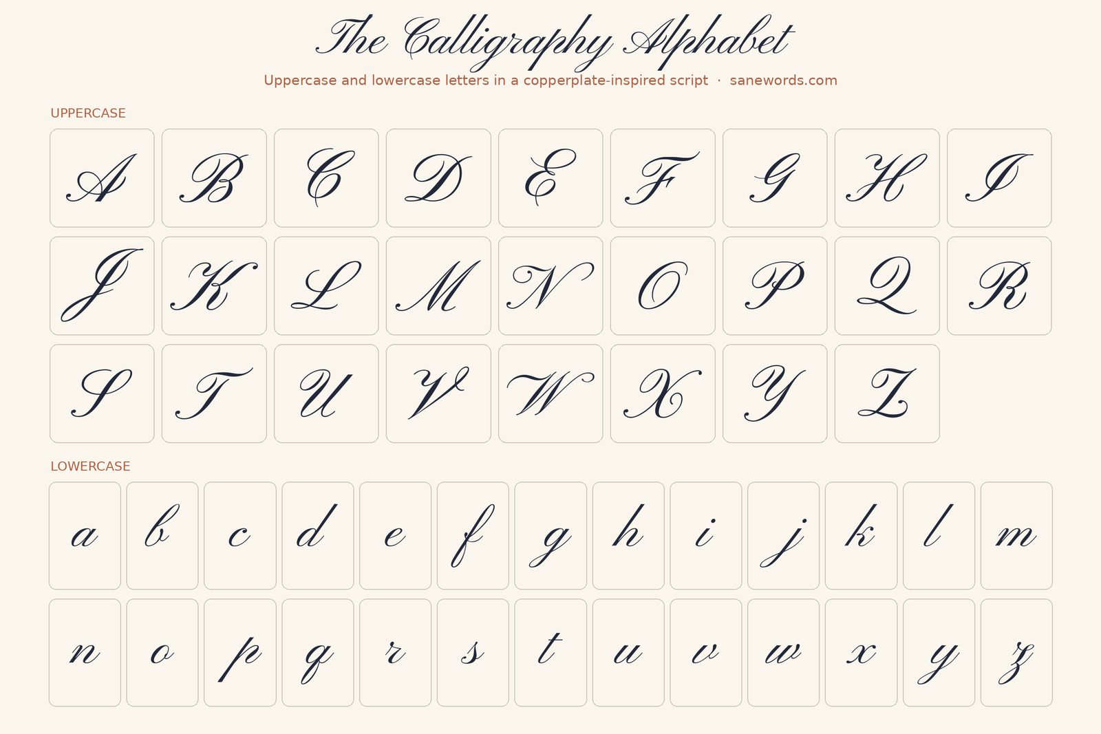
Notice what all these letters share: the same lean, the same rhythm of thick and thin, and lowercase letters that sit politely on one baseline. That consistency, not fancy flourishes, is what makes calligraphy look like calligraphy.
The one rule behind every letter: thin up, thick down
If you remember one thing from this page, make it this. In pointed-pen and brush calligraphy, every stroke that moves upward is thin, and every stroke that moves downward is thick. The thickness comes from pressure. Press down and a flexible nib or brush tip spreads, laying a broad line. Ease off and it closes back to a hairline.
That’s why calligraphy is slower than handwriting. You can’t scribble when every direction change is also a pressure change. Slowing down isn’t a beginner’s weakness here; it’s the technique.
The four guidelines (and why your letters wobble without them)
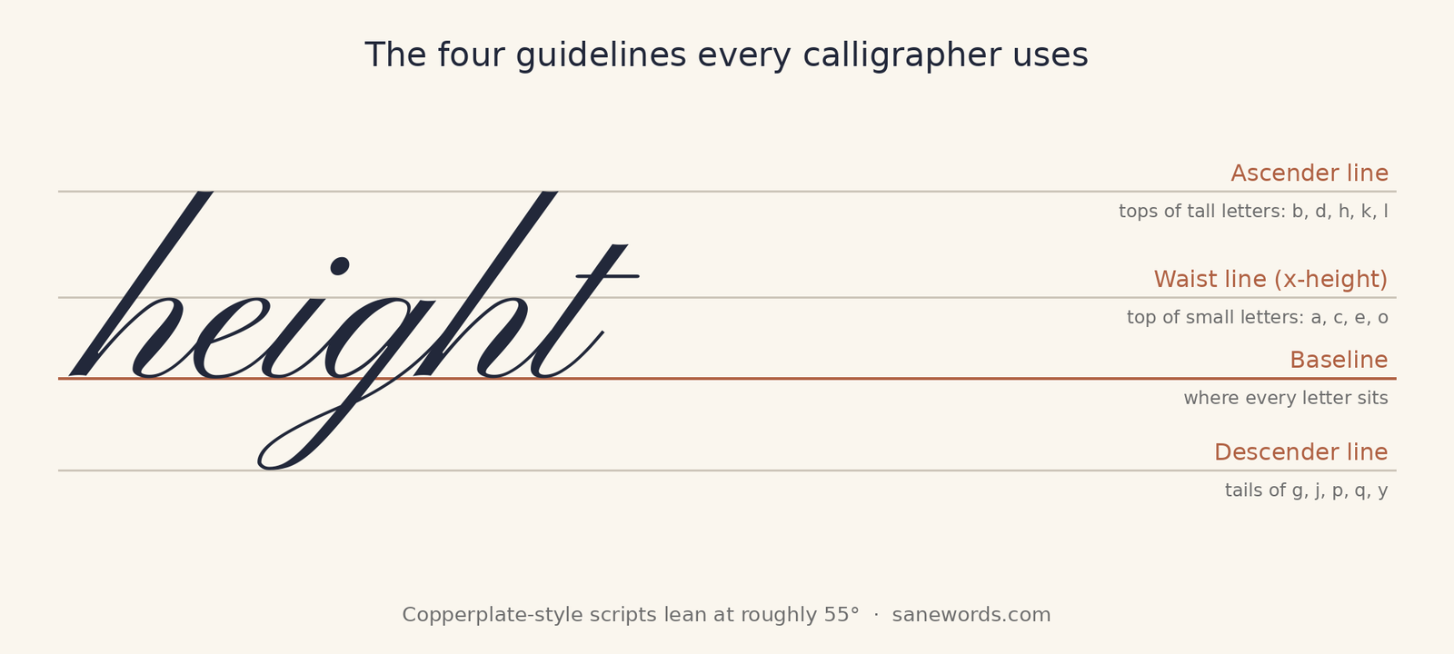
Calligraphers write between four horizontal lines:
- Baseline: where every letter sits.
- Waist line: the top of small letters like a, c, e and o. The distance from the baseline to here is called the x-height.
- Ascender line: how high tall letters like b, d, h, k and l reach.
- Descender line: how low the tails of g, j, p, q and y drop.
In traditional Copperplate, the ascender, x-height and descender often follow a 3:2:3 ratio, a proportion drawn from many 18th-century examples. Add slant lines too: Copperplate typically leans at about 55° from the baseline. Spencerian, its American cousin, sits a little more upright at about 52°. When your letters look uneven, it’s almost never your hand. It’s missing guidelines. The free practice sheets at the end of this guide have all of them printed in.
The 8 basic strokes that build the whole alphabet
Learn these eight shapes and you’ve learned most of the lowercase alphabet before writing a single letter:
- Underturn: a thick downstroke that curves at the bottom into a thin upstroke, like the bottom of a u. Found in a, i and u.
- Overturn: the underturn upside down: a thin upstroke that arches over into a thick downstroke. The heart of n and m.
- Compound curve: an overturn flowing straight into an underturn, as at the end of n.
- Oval: drawn counterclockwise from about two o’clock, heavy on the way down and light on the way up. Hidden inside a, d, g, o and q, and half of it makes c.
- Reverse oval: a line that rises and then swings clockwise into a thick downstroke. Gives b its belly.
- Ascending stem loop: a thin line climbing to the ascender line, then a thick stroke straight down along the slant. The backbone of b, h, k and l.
- Descending loop: a stroke that drops below the baseline and loops back up. The tail of g, j and y.
- Entrance stroke: the thin hairline that leads into a letter and connects one letter to the next.
Spend your first few sessions on strokes alone: rows of underturns, rows of ovals. It feels like you’re not “doing calligraphy” yet. You are. Every teacher worth listening to starts here.
Learn the lowercase letters in families
Instead of practicing a to z in order, group letters by the strokes they share. Each family reinforces the same motion, so you improve several letters at once:
| Family | Letters | Built mostly from |
|---|---|---|
| The simple strokes | i, u, t, w | Entrance strokes and underturns |
| The arches | n, m, v, x | Overturns and compound curves |
| The ovals | a, c, d, e, g, o, q | Ovals plus a stem or tail |
| The tall loops | b, f, h, k, l | Ascending stem loops |
| The tails | g, j, p, y, z | Descending loops and long downstrokes |
| The odd ones | r, s | Their own small shapes; save them for last |
Start with the simple strokes, then the arches, then the ovals. By the time you reach the loops, your hand will already know most of what they need.
Uppercase calligraphy letters: tips for the capitals
Capitals are where calligraphy gets theatrical, and where beginners get overwhelmed. A few tips keep them under control:
- Master lowercase first. You’ll write far more lowercase letters, and capitals reuse the same ovals, loops and pressure changes at a larger scale.
- Look for the main downstroke. Nearly every capital has one dominant thick stroke. Find it, get it right, and decorate around it.
- Practice similar capitals together. Letters that share a structure, such as B, P and R, or U, V, W and Y, are easier learned as a group.
- Add flourishes last. A plain, well-proportioned capital looks better than an elaborate wobbly one. Swashes can wait.
Calligraphy styles from A to Z: which alphabet are you learning?
“Calligraphy alphabet” can mean several different scripts. Each has its own tools and its own look:
| Style | Tool | Look |
|---|---|---|
| Copperplate | Pointed nib | Elegant and strongly slanted, about 55°. Dates to the late 17th century, when it was called English Round Hand. |
| Spencerian | Pointed nib | A lighter, more delicate American script from the 19th century, at about 52°. |
| Italic | Broad-edged nib or marker | Rhythmic and readable with a gentle slant of about 5–10°. Born in Renaissance Italy. |
| Blackletter (Gothic) | Broad-edged nib or marker | Dense, upright and dramatic. Emerged in Northern Europe around the 11th century. |
| Uncial | Broad-edged nib | Rounded, ancient-looking capitals that evolved from Roman letters. |
| Modern calligraphy | Almost anything; often a brush pen | Bouncy and relaxed. Bends the traditional rules on purpose. |
The alphabet on this page follows the Copperplate family. It’s the best all-round starting point because its strokes carry over into Spencerian and almost every modern brush-lettering style.
No special pen? Try faux calligraphy tonight
You can practice the calligraphy alphabet with the pen in your bag. The trick, called faux calligraphy, takes four steps:
- Write your word in cursive, leaving a little extra space between letters.
- Trace over the word in the air with your pen. Every time it moves down, draw a second line beside that stroke.
- Fill in the gap between the double lines to create thick downstrokes. Leave the upstrokes thin.
- Repeat. Each word teaches your eye where the weight belongs, which makes the switch to a real brush pen or nib much easier.
When you’re ready for a pressure-sensitive pen, a small, firm brush pen like the Tombow Fudenosuke is a forgiving first step. We cover it in our guide to the best pens for journaling.
Free printable calligraphy practice sheets
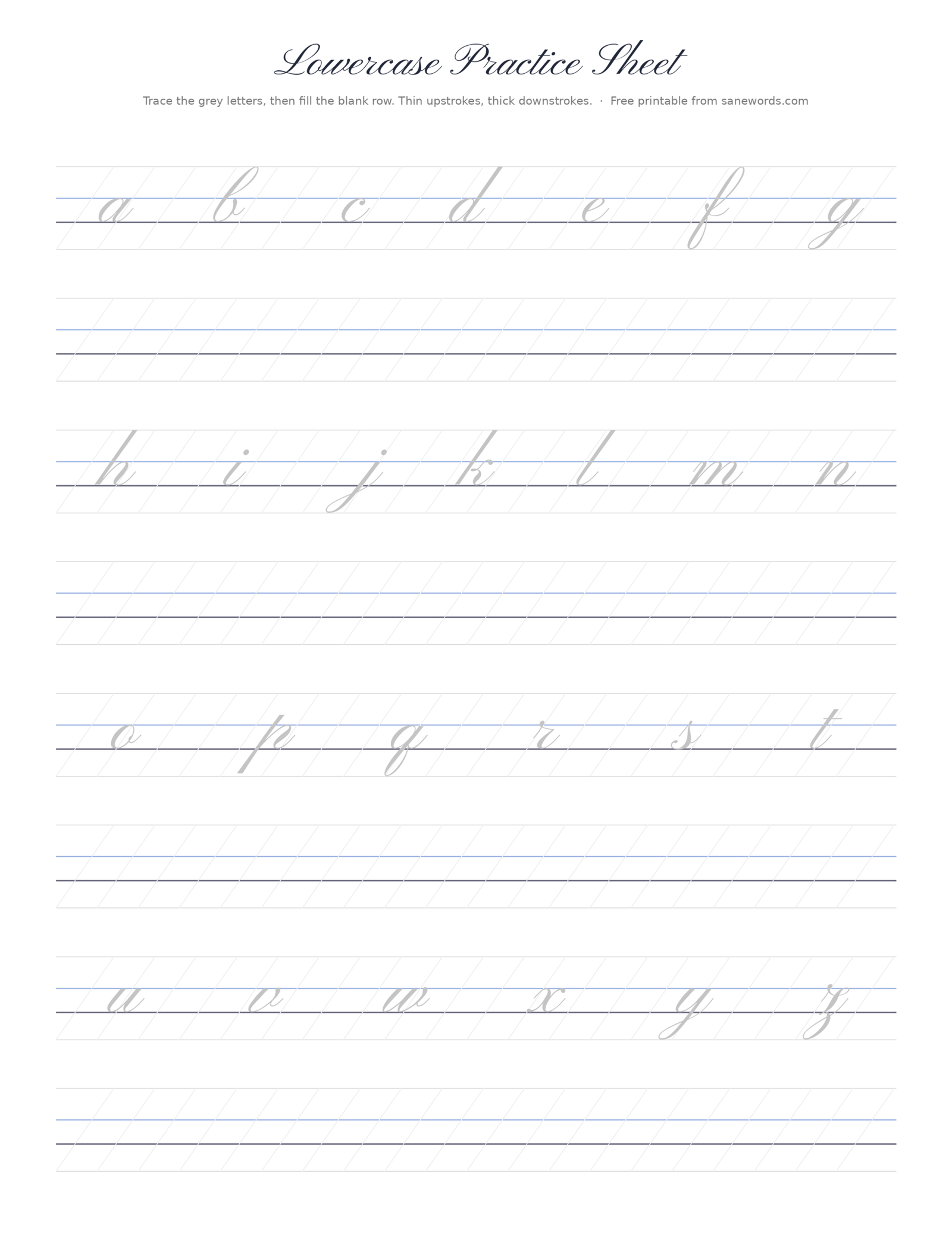
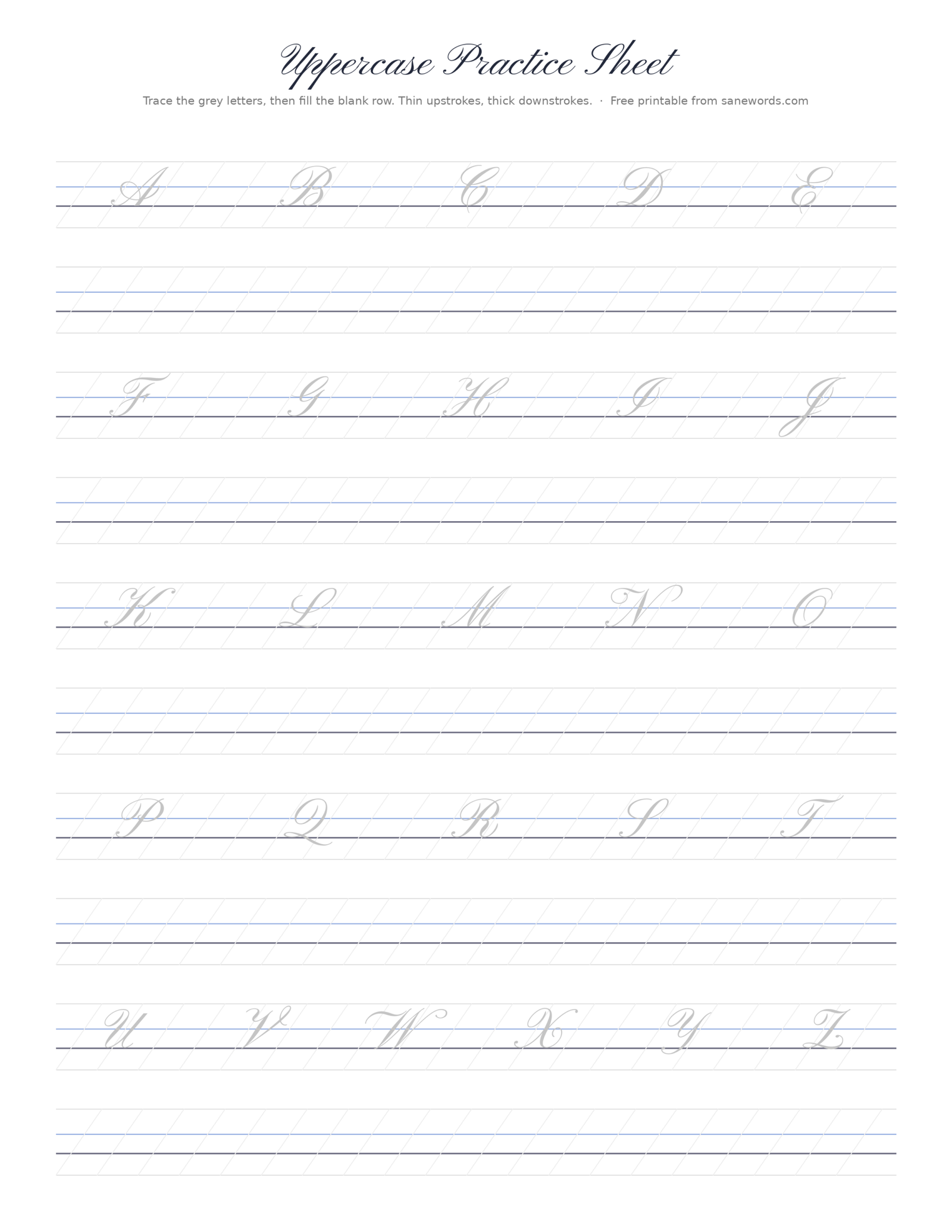
Here are two free practice sheets, one lowercase and one uppercase, sized for US Letter paper. Each row shows grey letters to trace with all four guidelines and 55° slant lines printed in, followed by a blank row to write the letters freehand. Click a sheet to open it full size, then print it with your printer set to fit the page.
How to practice so it actually sticks
- Warm up for two minutes. Rows of thick downstrokes and thin upstrokes loosen your hand before letters.
- Trace first, then go freehand. Tracing teaches the shape; the blank row proves you’ve learned it.
- Practice little and often. Ten minutes a day builds muscle memory far faster than two hours on a Sunday.
- Leave your supplies out. If your pen and sheets are on the table, a quick session takes no willpower.
- Keep your first page. In a month, compare. It’s the best motivation there is.
Frequently asked questions
What is the easiest calligraphy alphabet for beginners?
A simple, modern-leaning copperplate or brush script with few flourishes is the friendliest start. It uses the same eight basic strokes in every letter, so progress on one letter helps all the others.
Is calligraphy the same as cursive?
No. Cursive is everyday joined-up handwriting with an even line. Calligraphy is deliberate lettering that contrasts thick downstrokes with thin upstrokes and follows strict guidelines and slant. Calligraphy is slower and more decorative.
Can I learn calligraphy with a regular pen?
Yes. Faux calligraphy lets you practice letter shapes and stroke weight with any pen by adding thickness to the downstrokes by hand. A brush pen or pointed nib gives you real thick-and-thin lines once you’re ready.
How long does it take to learn the calligraphy alphabet?
It varies from person to person, but short, regular practice matters more than total hours. Most beginners notice a real difference once they’ve drilled the basic strokes consistently for a few weeks.
Why do my calligraphy letters look uneven?
Usually it’s missing guidelines or an inconsistent slant, not a lack of talent. Write on a sheet with baseline, waist, ascender and descender lines and slant lines, and slow down on every downstroke.
Start with one row of ovals
You don’t need to master 52 letters this week. Print the lowercase sheet. Tonight, fill one row with ovals and one with underturns, slowly, thin up and thick down. Then trace a, c and o. That’s how every beautiful alphabet you’ve ever admired began: one patient stroke at a time.
Explore more in our Calligraphy & Hand Lettering guides.
Sources and notes
The alphabet chart, guideline diagram and practice sheets were created by Sanewords using Pinyon Script, a free copperplate-inspired typeface released under the SIL Open Font License; they show standard letterforms for reference and practice. The 3:2:3 proportion and the 35°/55° slant come from Scribblers’ guide to Copperplate basic strokes. The eight basic strokes draw on Loveleigh Loops. Style details draw on Lettering Daily’s guide to calligraphy styles, and the faux calligraphy method on Zebra Pen.

Leave a Reply